Your logo is the foundation of your brand identity—it portrays your values, fosters connection, and evokes emotion. For instance, if you wanted to communicate strength, leadership, and courage, choosing a lion logo would be the way to go.
It’s why brands like MGM, Ritz Carlton, and Chelsea FC choose to have a lion emblem in their logo.
To help inspire you to create your lion logo, let’s break down some of the most famous lion logo examples and why it works for these brands.
10 lion logo design examples to inspire your next logo creation
Since your logo becomes your brand’s 24×7 spokesperson, creating a logo can be pretty stressful. You may know that you want to feature a lion, but there are thousands of design styles, typefaces, and colors to choose from.
Looking at how established companies and brands have evolved their lion logo can serve as design inspiration when deciding the creative direction you want to take with your logo design.
1. ING Group
ING, a global bank, has an orange lion in the logo, which goes back to its Dutch roots—Netherlands’ national color is orange, and the national symbol is the lion. The logo also represents the bank’s history because several of its founding companies also had a lion in their logos. The lion has survived many mergers and remains a prominent feature in ING’s logo.
The logo font is Times New Roman in all capitals, and while the lion is orange, ING appears in a blue-violet shade.
2. Premier League
Premier League’s logo has gone through many changes over the years. While previous designs featured a football, this is the first to avoid that. The lion has also evolved from being more of a 2D character to a 3D one.
The current design was introduced in 2016 after Barclays stopped sponsoring the league. The lion and the words “Premier League” are in the same shade of dark purple. The typeface used is a rounded sans-serif.
3. Metro Goldwyn Mayer (MGM) Studios
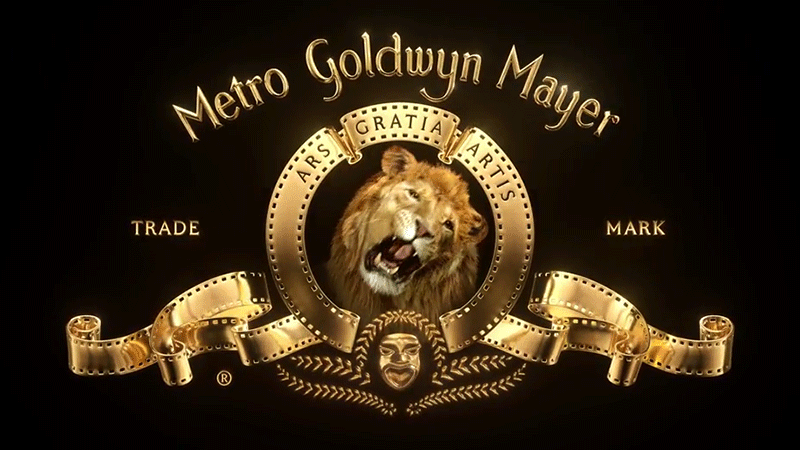
The MGM lion is a cultural icon featuring a roaring lion face, Leo, whom we know so well. The logo has gone through 9 redesigns with the lion at its core. But the interesting part is that much of the logo we see today was designed in the early 1980s.
While Leo the Lion was a staple for 100 years, MGM updated its logo to create this metallic gold version and replaced Leo with a CGI double. The slogan “Ars Gratia Artis” means art for art’s sake.
4. Lonsdale
A boxing and martial arts apparel designer, Lonsdale is a British brand founded by Bernard Hart in 1960. The brand is named after Lord Lonsdale, who organized the first boxing match in gloves.
For a brand that wants to communicate strength and courage, the lion is an excellent choice for Lonsdale. The wordmark (“a distinct text-only typographic treatment of the name of a company for branding”) is placed below the walking lion. The wordmark uses a custom typeface and the L in Lonsdale forms an arch for the rest of the letters.
5. Peugeot
Peugeot, a French car manufacturer, has a logo dating back to 1847, making it the oldest car logo in the world. The lion logo has gone through several redesigns becoming bolder and bigger as the years went by.
The version with the lion on its legs (rampant) took hold for a while. Eventually, Peugeot decided to opt for a simpler logo doing away with the lion’s body for the first time in 50 years.
The new logo reflects the brand’s changing model line-up and new philosophy with a left-profile lion crest in black. The wordmark uses the square sans-serif in capitals.
6. Ritz Carlton
Ritz-Carlton, a luxury hospitality brand, has always had a lion in its logo. Cesar Ritz created the brand by combining the British royal seal i.e., the crown logo, and the icon of a financial backer, the lion head.
In 2015, Ritz-Carlton made the first change to the revered lion and crown to “clarify, simplify, and amplify” the brand identity. Updating the lion head, crown, and the color blue was the brand’s way of signaling continued relevance. The font used in the logo is Goudy Oldstyle.
7. Lowenbrau
Löwenbräu is the world’s oldest beer brand and translates to “lion’s brew.” The origins of the logo date back to the 17th century. The original brewpub, Löwengrube (Lion’s Den), had a 17th-century fresco depicting Daniel in the Lion’s den.
The logo has a standing (rampant) lion with its tongue sticking out and a double twisted tail. The term rampant refers to the lion’s position—standing upright with its forelegs raised, claws unsheathed, aimed to strike. The color palette includes two tones of blue (the color of royalty) and gold.
8. Royal Bank of Canada
In its 155-year history, The Royal Bank of Canada (RBC) has redesigned its logo several times with one constant: the lion. Some of the earlier versions didn’t have any color and had quite an elaborate lion.
The logo used today was designed in 2001 as the Royal Bank evolved into a financial services company. The new brand name RBC was chosen for the logo to showcase the diversity of the business. The logo is an homage to tradition and honors the brand’s Canadian roots by keeping the gold lion and globe. The dark blue and yellow colors and the simplified design are a testament to the brand’s optimistic outlook on the future.
9. Chelsea Football Club
Chelsea Football Club (FC) has quite a story behind its lion mascot. The club’s first logo was the famous “Chelsea pensioner,” which lasted almost 50 years. In the 1952-53 season, the club’s manager Ted Drake rebranded the logo and replaced it with a coat of arms and the club’s initials on a blue background, but it didn’t last long.
The lion rampant appeared for the first time in 1953 and wasn’t designed from scratch but inspired by the club’s era owners—Counts of Cadogan. When the ownership passed to Ken Bates, the lion rampant turned into a roaring one. Finally, in 2005, the new owner, restored the logo to the lion rampant on fan requests.
The logo is made up of 5 parts—”the base, the blue circle, the Chelsea emblem, the blue lion, the walking stick, the symbol of Abbot of Westminster, the roses and the football, symbols of England and the English game and the sign that reads “The Chelsea Football Club.”
Lions seem to be a common part of football teams and associations as the FA, KNVB, and Aston Villa all have lions in their logos.
10. Pringle of Scotland
Pringle of Scotland, a British knitwear brand, has an iconic animal logo featuring the Pringle lion. The lion symbol was first used on garment labels in 1934 and still appears on key pieces in the men’s and women’s collections, interpreted in different ways for the latest collections.
The lion rampant was historically used on the coat of arms of royal heraldry in the UK and Europe and symbolized courage, bravery, nobility, and strength. Keeping the heraldic lion is the brand’s way of paying homage to its history.
Time to create your lion logo
Now that you’ve seen how other brands designed their lion logos over the years and what it means, here’s how you can create your own.
Look at your company’s mission and values and see what kind of lion—roaring, modern, rampant—would fit it best. You can also think about whether you want to use a lion head logo, a lion shield logo, or a royal lion logo. Next, consider how it would appear on all your communications and channels—business cards, T-shirts, mugs, email signatures, or real estate signage.
Finally, you can have a graphic designer or use graphic design software to mock up a few lion logo templates so you can visualize its appearance in different styles and channels. You could also use some vector graphics if you’re on a tight budget. Use your brand’s color scheme to add in the colors and test the new logos until you find one that best represents your brand.